‘’We won’t be conducting specific user research for this project, as we want to focus on your visual design skills. Nevertheless, as a UX Designer, you know how valuable it is to understand the problem and the user before you jump to conclusions. You need to determine that the proposed feature is one that users would find valuable and would use. If not, you will need to pivot.
As a new designer joining a team, you’ll often have to rapidly come up to speed on your product and users, and quickly iterate on proposed solutions under tight timelines.
Your other stakeholders will all have opinions, and you’ll have to get used to supporting your claims and finding ways to incorporate new features into the existing platform based on user needs.’’
This assignment, compared to the last two, was a solo project — with no teammates to directly assist in the process. Our objective was to begin the process of creating a feature for an existing app that already exists on the market. With this, we were presented with a list of suggested applications to work away on.
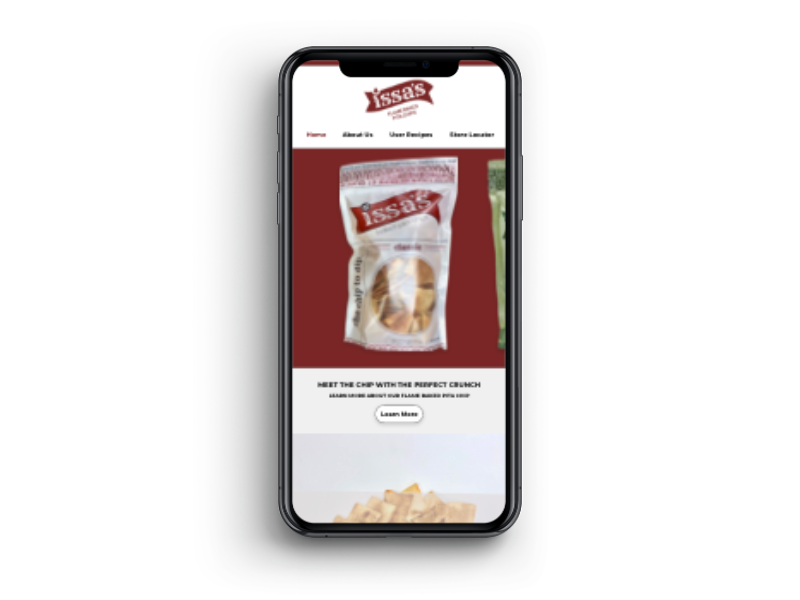
My choice in this list ended up being: Instagram
To wit here are some details about the application:
To keep it brief, I settled on this choice because frankly, I couldn't use Instagram to save my life — in fact, I had only started using it properly at most a few weeks before the project began. I’m not a big social media user so I thought it would be interesting to try and pluck this app apart.
Consequently, I would have no built-up biases or defenses for the app, I could look and develop at this process in a purely objective matter…plus you know, it could be fun working something you don’t completely understand.
To get a good foundation as to who is the primary audience, some preliminary research on demographics was made in order to get a baseline as to who this feature will be focused on the most.
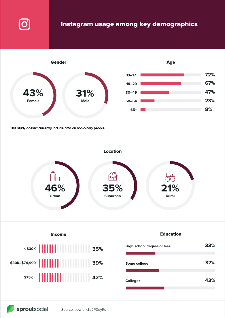
Apparently, unsurprisingly, this being a free app with a rapid up and coming new generation of people immersing themselves in social media — Instagram is basically an institution with younger folks. If there’s one thing I know young people like is speed and convenience.
With this in mind, I already had a good idea of what kind of feature I might be focusing on down the road.
So with our foundation of research established, you know what means, time to indulge ourselves in some research artifacts.
Since you probably already remember how some of these work, I’ll just focus on what they ended up accomplishing.
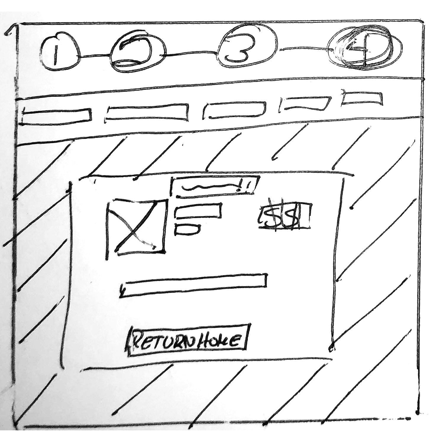
Here I begin drawing a rough outline, and hypothesis on the process of who this design.

With this, I’ll get a good idea of what to expect on the road ahead. Steps 5–7 were to be filled in later in the process in order to avoid getting ahead of oneself in the process and focus on the information you have now.
With our rough outline of how this process will follow I proceeded to the next step.
To get an idea of how or what we’ll develop this feature, we of course had better go ahead have an ol’ gander at what the competition is doing.
But before even this, let’s look at who the competition is first…
Now the know, let’s pick them apart and see what differentiates them, and makes them similar to each other.

A lot of Instagram’s competition is pretty similar in purpose. For the most part, almost all of them have some kind of media share and communication aspect in mind in their feature suite.
Now with the competition laid out, it was time to slap them on to this find out where could a potential feature for Instagram can be found.

For this project, much like the last, I decided to emphasize a focus on the Qualitative Research aspect. Since this was a feature that was going to be personalized to the user's needs, I need a personal way of finding out exactly what they needed. Something an indirect survey would probably not accomplish.
To get some first-hand insights into the Instagram user base, I decided to interview five people over their experience with the app. Following this, here were some of the things that stood out from those interviews:
‘’I didn’t start actively using Instagram until the past two years. I only started checking it more frequently when they added stories like Snapchat…’’
‘’I really would be very happy if Instagram had more functionality in the stories that you could post stories to groups of specific people of my choosing.’’
‘’It was too much work personally to post things every now and again.
It just didn’t seem interesting to use sometimes.’’
‘’Stories suck. They copied Snapchat, but they did it worse somehow.
So it’s not good.’’
While most had no critical complaints against Instagram, some had a bone to pick had grievances with the ‘Stories’ component of the app. Many found it tedious to scroll through the copious amount of user stories and finding the content they’d prefer to see in that section.
Another clue as to what I need to focus on next then…
By this point in the project, I was about a day behind on my progress, and stress and anxiety started to kick in. I already had an idea of what I thought I should do. I ended up expediting the following section of the process in a matter of a day or so, which of course in hindsight was not ideal.
More on this in a bit.
Now, no new tools this week. Mostly just the same artifacts as before:

Here much as I’ve done before, gathered some of the primary things I found in my interviews and Secondary Research. I found some commonalities in ‘Why’ they use Instagram and ‘What’ they dislike from it in its current format; those being the fact that it is their primary way of connecting and keeping up with their friends and loves ones — and their grievances were the general lack of control over the content the ad provides.

Here I got a rough outlook of the customer's jobs-to-be-done, their pain points, and what they stand to gain from using Instagram.

I, being the novice Instagram user myself, imagined a rough idea of how the User’s Journey through the app itself may look like on paper. Like most apps, I’ve seen other people use, they tend to follow a pattern of checking in, liking, or commenting on friends' posts, maybe shooting some a message, and finally seeing what other content creators are up to.
Now while the As-is scenario gave a rough blueprint on how someone’s journey on the app may look in paper, it was time to graph it out to get a more first-hand look at this in action.

Due to the aforementioned loss of time mentioned in the Define section, I created this Journey Map without properly aligning it with my Secondary Data this time around. I had jumped on this part of the process to save time ahead of the previous artifacts but ended up causing myself a serious mental block that lasted another day — eating up more precious project time.
Since I was already way over time, I decided that a new journey map could not be created in time to reflect the change in the user’s experience.
If you’re cringing over this fact, believe me, I was too.
Before getting on with this I settled on the problem statements found in the process so far. Here, given my unstable process so far during the week I had to rephrase my problem statements a few times, here’s what I settled with:
With these established, it was time to ask me a few questions:

After that, here is where the problem became readily apparent in my process this week. Since I decided what direction I was going in very early on, it ended up seriously gutting the Brainstorming process, because I was too focused on the specific solution I had set out to do.
But the damage didn’t end here…

As you can see, I settled on powering through this section on my Miro board, and leaving it behind since an MVP was already identified for myself early on through my research data, and problem statements.
Another sign of hardship to come.

As I revisited the Value Proposition Canvas, I once again noticed much like my Brainstorming and Affinity Map before it — my solutions were far too narrow.
Alarms and red flags were going off in my head for days now.
My process is seriously undercooked compared to the last two weeks at my time in Ironhack and it was affecting the foundation of this idea.
Anxiety was now turning into a quiet panic.
So, as best as I possibly could, I settled on developing my MVP with all the information I’ve been able to gather.
So to recap, my solution would help keep the app feeling simple, and yet more intuitive; consequently, this helps to keep the user more engaged by better facilitating the content they want to see.
Consequently…
The minimum viable product is an added function instagram to allow users to be able to better curate their user stories.
So with the MVP established I set out to create a user flow of how one would be expected to navigate the new function App in question. Details below.

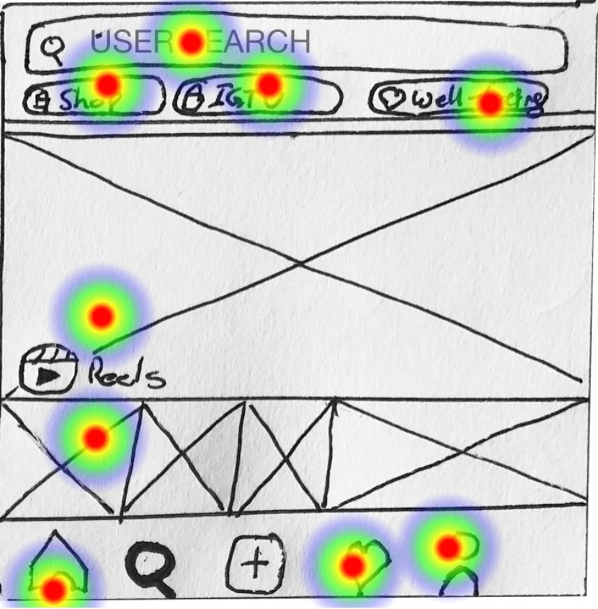
So with the User Flow established I set out to create some rough wireframe of how the user flow will end up looking like. I sent it out to six people to test to see if it functions as intended.
I included a test on the bottom of the image if you wish to try it out yourself.
After sharing in all the test yielded positive results from the user base:
(As of September 4th, 2020)
So all in all, the proposed solution and user flow had great success, but I was coming up extremely short on time…
I was coming down to the wire in submitting my project in Hi-Fi form, but it was readily apparent that my slowness from earlier pretty much put a nip in the bud for those plans. So I settled on making my Mid-Fi prototype as accurate as possible.

In the end, my mental block at the start of this project cost me a lot of invaluable time. I couldn’t get the project complete on time to a stage I was happy with. Not helping were some mid-way pivots I had to make to accommodate my proposed solution. I'm hoping to create a prototype to clearly demonstrate the feature I had in mind in due time.