At the beginning of this year (2022) I was reached out by ‘oneighty/FCB’ to create a website for a client seeking to revamp their online presence. The client was an Immigration lawyer, Atty. Daniella V. Hernandez had previously commissioned via an intermediary through oneighty/FCB to create a website for her business. The website was made for her clientele more of an idea of who she is, what service she provides, and most importantly — a clear path to scheduling an appointment with her to provide them with the most robust and thorough help in regard to their pending immigration status.
I knew the project was rapidly appearing to be a great experience as Danielle’s business was something that resonated with me personally, and it was a hugely human problem that needed solving.
This was going to be one of my bigger projects, probably the largest as of yet, with various types of media involved. I had not been charged with essentially being both an art director and UX designer for a project before. Aside from having a dedicated copywriter, I had to set off and get busy.
This was time sensitive considering the prior domain DVH Lawyer Group was using was set to expire within a few weeks. We were off to the races.
Problems
The first issue that she wanted to address was establishing an efficient through-line to her and her services for her customers. She has social media presence to help further the visibility of her services, but no nexus for all of that material to be tied together through a website. The one that was present was undercooked in development and had a somewhat visible if noisy path to her Call To Action.
The Users & My Research
The clientele is Central & Southern Americans looking to move to the United States in search of a better life. The vast majority of those that make the arduous trip have very little in the way of resources at their disposal. Be it human, technological, or otherwise. They may have at most a smartphone to help them get around. I researched some existing mobile-ready legal sites as inspiration to get an idea of what I needed to do next.
A lot of the clientele were also, primarily Spanish speaking, so making the website around that was essential. However, given the vast amount of dialects present throughout the Americas, and perhaps some may speak and read English better than Spanish — I would also create the website in English text as well to help bridge any potential language gaps.
The tools of the trade
Aside from the considerably increased responsibility for this project, it was clear I was out of practice when it came to hand-coding HTML5 and CSS, among some other Java elements. Luckily, since the heydays of my bachelor’s web design classes, bootstrap programs and services have taken off considerably in the intervening years. I set off looking for a similar to encapsulate the client into a program that was easy to use and edit for themselves in the future if they so desired.

After a bit of searching, Squarespace was the best candidate. It had the easy of use I was looking for and the potential for custom editing the page on the fly if changes had to be made. It also had other integrated business metrics and user journey mapping for the webpage itself. This was a match made in heaven. I brought out my trust sketch pad, 2B pencils, warmed up Adobe XD, and got to work.
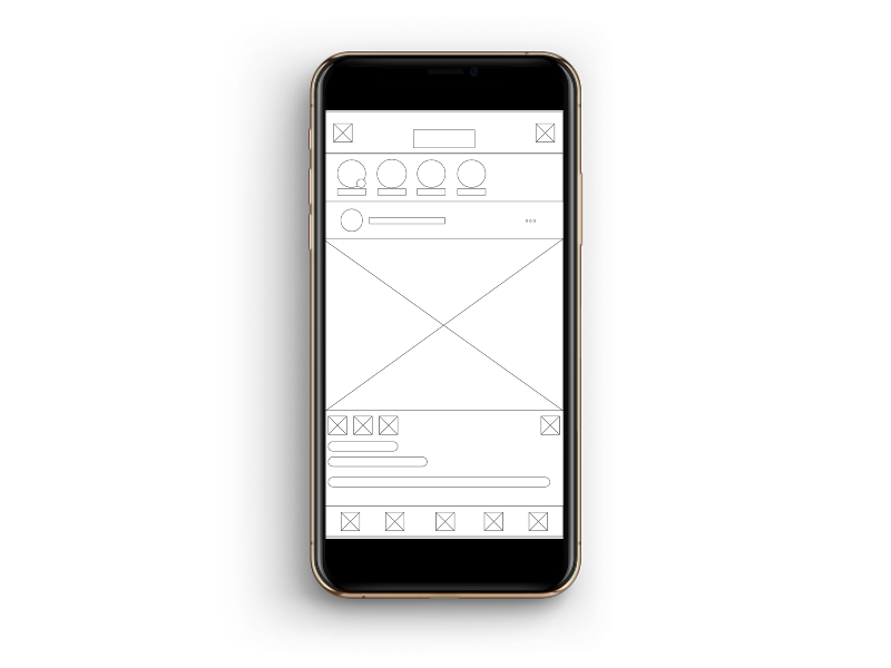
Lo-Fi Prototypes
Once I had covered as much as I could I began drafting away sketches on how I wanted the elements of the page organized. The client wanted something simple, given that these users may not be well-versed in navigating some of the more contemporary interfaces available today.
My CTA would be drafted on the landing page with the appointment button containing the link to their scheduling service readily apparent and available.

After some brief sketching, and submissions for review. I began the next phase.
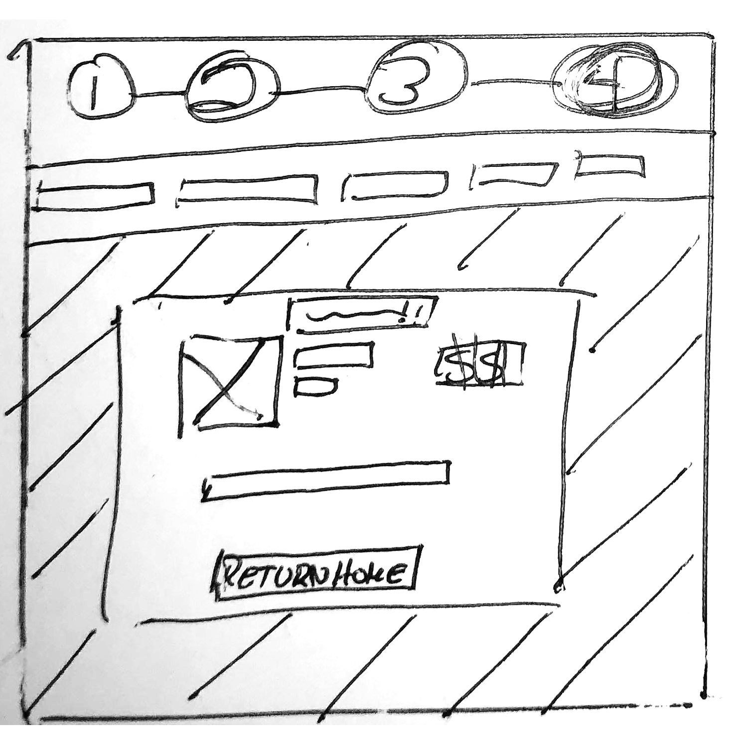
Hi-Fi Prototype
After the initial conceptualization phase, I began drafting some mid-high fidelity examples based on what was provided to the client previously.
We settled that it was far too simple and didn’t give the user a good idea of her qualifications or if she could help them based on their nationality.

Knowing this, two new A/B examples were submitted to the client to review. After some deliberation, they settled on Version 2 as to what they were looking for.

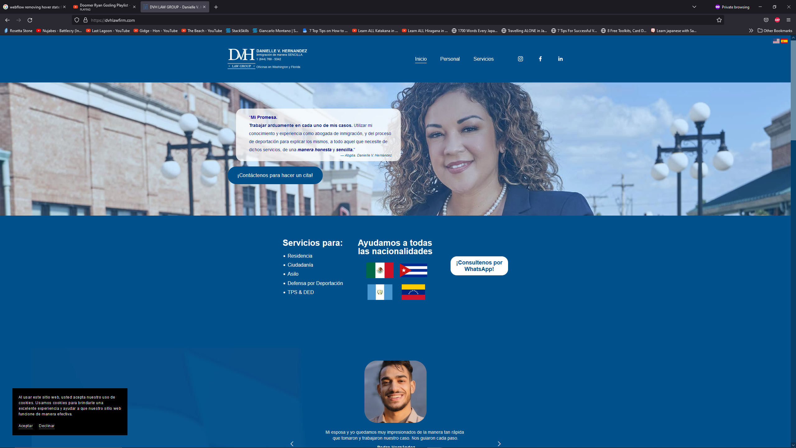
As time had gone on, some changes were requested, such as creating a carrousel style banner on the landing page. Inserting some flags, the client’s qualifications on the bottom, and some testimonials. Blue color accents were also decided to be used throughout all the page. Aside from being my favorite primary color, Blue has been shown to have a soothing, calming psychological — proving a sort of relief and sense of stability for humans.

After a dozen revisions, the final page was beginning to take shape. Danielle was shown prominently on the landing section of the home page. Our Call to Action button was finally inserted in plain view, so along with her promise message, a user would be able to immediately schedule a meeting within seconds of arriving on her page.

Since the project was very internal between the oneighty/FCB & DVH Law Group, user testing was limited to in-house staff only; with most of the test showing a fairly binary user path to the CTA. Some found it, others were confused.

After a quick tweak to the language on the CTA button, from the ambiguous ‘’Contact Us’’ to ‘’Schedule an Appointment’’ as shown on the launched site, the problem was promptly solved.
After much trial and error, the ‘Gold’ version of the website was complete and presented to the client for approval. After some last-minute tweaking and features like a language selection button on the top-left of the website, it was finally time to launch.

Conclusion and results
The website was finally launched and after a radio advertising drive, turned out to be a huge success! The metrics on the Squarespace software showed that Danielle began having hundreds of new clients coming into the website within the first 5 days of launching. With that number has grown steadily since then as you see here.

Resolution
This was an interesting project for me to undertake. On the one hand, I’m not well-versed in Web design itself. I had to depend on a medium such as Squarespace to help construct, code, and design the site. On the other hand, I got to re-learn a lot of skills I had lost over the years. Most of all created something for the first time that felt really worthwhile which will bring ease and peace of mind to a lot of people going through the process of making a new life for themselves here.
While the project is complete I have been notified about the potential to expand the site in the future. The next steps for me coming back would be finalizing the Biographical sections of Danielle & her staff, perhaps inserting video media and additional social media presence.
Link: https://dvhlawfirm.com/
Until next time!