‘’E-commerce is well-studied in the industry, so this week we will devote the most of the research time doing a market research and conducting a competitive analysis. We will be focusing our efforts on delivering great online shopping experiences for the end users.’’
For this new project, me and my teammate got together and after a few minutes deliberation — decided to pick a well-known chain of local book stores located out in San Francisco, California.
That store chain in question called: Green Apple Books.

We settled on this particular store because my partner had some good experiences going to the store itself…and I’m rather partial to a good ‘mom-and-pop’ style book store myself.
Consequently, we found the prospect of fixing up their e-commerce side of things pretty fun — so we set out in getting started by finding some data.
Some basic facts about Green Apple Books:
Key Distinguishing feature: large rare selection — perfect for browsing
but has an antiquated website that causes confusion and overwhelms to the users.

Like Green Apple Books, there are more than 2,300 independent bookstores located in the US.
These stores, along with major retailers tend to generate about $750 million in retail sales each month. (Statista)
However, they all have started to break some sweat recently, given the advent digital marketplace of the 2010s; and with the more immediate issues like COVID-19 keeping people away from brick and mortar stores; and a general interest in stores like these waining slowly over time with the newer generations of people are no doubt making things every more arduous for independent stores like Green Apple Books to staying relevant each year.
Now with the gist of the project details and preliminary data out in the open, it was time to explore more of the business itself. Buuuut…it wouldn’t be near as fun if we didn’t have some new tools to use this time around.
And man there were a lot of new tools this week…
Here is a list of things to come imminently on your reading.
This time around we got a new little artifact to use for our project. My program TAs supplied us with this little nifty new tool: The Lean UX Canvas.
Now while I can sit here rambling on like a dilettante about what it’s used for and what not…I think it’s better to let the canvas’ creator sum up this particular artifact’s purpose.
“The Lean UX Canvas helps teams frame their work as a business problem to solve (rather than a solution to implement).’’
— Jeff Gothelf.

Now with that in mind, we used this canvas to generate a quick hypothesis to the problems we would end up addressing later on in the project.
With our general outline of things that need to be done, we gotta figure out what Green Apple Books competition would be doing.
Now we could list the features individually and painstakingly but let’s face it, you’re not going to strain those nice retinas reading word-for-word summing up ‘we got and they don’t.’
ENTER — the Competitive Feature Comparison…table.

This nifty new artifact demonstrated to this week helps one quickly distinguish features and find trends in what the competition might have in common, and what may set them apart.
Immediately we found some interesting things when it came to analyzing Green Apple Books’ competition:
With some of the tidbits in mind, we proceeded to the next step.
Yet another tool presented this past week, I and my teammate used the Market Position chart to build off the information provided to us by the prior Competitive Feature Comparison chart.
Now.
We know who the competition is, we know what they do, but not exactly where they reside in the in regards to each other on, you guessed it, the market.

We filtered the competitors and where they resided between their community outreach, and in overall cost. Once everything was mapped out, we identified a big area of opportunity of untapped potential in this market that we could try and take advantage of for our client, Green Apple Books.
Now with most of our preliminary data gathered we needed to find out exactly what might be hurting Green Apple Books position when it comes to all things e-commerce.
Consequently, we set off to use our last new nifty research procedure presented this week: The Heuristic Analysis Summary.
This procedure assesses the websites’ potential for usability among many a consumer for use.

To start, we took a look at the website, and found some major problem areas that may have been driving users away. While there were a few, these are the ones that stood out the most:
For this project, we decided to omit the quantitative data this time around in the interest of time, and we settled that focusing on getting other people’s first-hand experiences in not just this store but others being far useful immediately.
While we toyed with the idea of surveys, we ultimately decided not to for the sake of a more focused and personal data gathering solution.
We had 1 SME interview and 4 user interviews, and additionally several online reviews in not just people’s experience with Green Apple Books’ store, but other places like it as well to tap into the users’ overall experience at a book store.
For book stores themselves…
“felt like wanted more money to buy all the books…always used books as an escape since I was young”
“ahhhh”
“sanctuary”
“church”
“getting lost and finding something rare”
And on the website side of things…
“Browsing books are in random categories and lots out of stock”
“You can find autographed books (listed on their website) and attend author events at this location.”
So with all this valuable data, we had to filter it all out somehow, which is we’ll be revisiting most of last week’s tools to tackle the define phase of this project:
So with all the details, we learned about the competition, and the data from our interviews we proceeded to organize our ideas thusly.

We found that a lot of folks tended to go to these kinds of books store to admire the organized chaos, touch the media with their own hands, and like many would retreat to a convent for spiritual guidance — users would come to places like Green Apple Books to escape from all the humdrum of daily life.

Unlike the previous and the following artifacts, this one is a new UX tool to us as well this week, the Value Proposition Canvas.
To give you a quick info dump on what this artifact does,
the value proposition canvas is essentially a summation of what kind of jobs customers hope to satisfy when they partake in the business place in question.
This also addresses potential pain points and gains they stand to deal with respectively when it comes to using the e-commerce system of Green Apple Books’ website.

With this in mind, we found some notable info from this:
Now while this is all very useful stuff, this is only one half of the process, as we’ll still need some data to add on the opposite side of the canvas. More on this later.
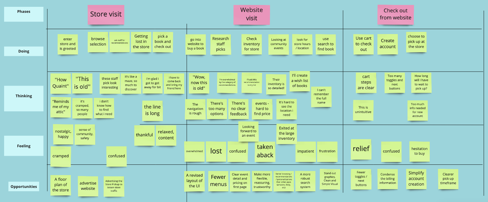
Much like last week, we used an As-is scenario map to get some insight into a users’ journey into the e-commerce process.
And what is an As-is scenario map without a User journey map; much like before, it is here to save the day by helping us graphically detail our customer's journey through the website.

To keep it short, the user in question has been having a very hard time trying to navigate the archaically designed, and rather unresponsive website. We discovered some ideas and opportunities along the process that we might able to add later.
Onto problem statements.
With our problems clearly laid out, we settled into our problem statements following this.
Our users: local regular customers using the website are:
Following the prior step, we set out to form this problem into questions to better drive our problem-solving.
Now we’re approaching the endgame of our project process. In these last phases, we’ll be wrapping up our
To better answer the previous question we settled on, you guessed it, brainstorming ideas on how to best answer said questions.
A little twist from last’s brainstorming session, we settled on taking a decidedly more analytical approach to brainstorming this time by adding some extra facts above all the HMW questions to help quickly fire off more ideas throughout this phase.

Another familiar sight in the UX design process. We set out to use the Moscow method to filter all the previous ideas and organize the potential features that could work best to alleviate the user’s woes.

Hey, remember this? Now that we’re further along in the process, we can go back to the value proposition, and start filling the left side of the canvas.
From adding the products and services, we derived possible pain relievers and creator gains for Green Apple Books after our intended changes go into effect.

The Jobs-to-Be-Done framework is a representations of user needs born out of qualitative user research, such as field studies, interviews, and discount usability testing. It involves identifying for which goals customers “hire” your product (and, ideally, also finding out if there are competitor products that these users are ready to “fire”). Armed with this understanding, a product team can think about the nature of the users’ core problems and needs from a fresh perspective, and devise product features that solve that main need as best as possible.
-Page Laubheimer
Now that we defined what this process entails and does, we
Our users: local regular customers using the website are:
MVP
In order to directly address these three problems, our minimum viable product, therefore, is a redesigned website that makes it easier for our users to search and purchase from a curated selection of books.
Green Apple Book’s new website will give users an organized, efficient, and informed experience.

To recap, our first solution to better the users experience on the website is to organise, and modernise all the User Interface elements on the website to assist with clearer navigation.

Our second solution is to improve the antiquated search function the website has, in order to make user searches for books a far more efficient, and streamlined experience.

The last solution is to better promote peace of mind for the customers using the e-commerce system of the site by keeping them more informed of third-party links, security measures, and time for store pick up.
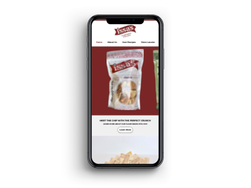
Now with all the suggestions, ideas, HWMs answered — we created an interactive Low Fidelity prototype with the following features in mind:
We gave them the goal of trying to navigate, checkout, and ‘purchase’ their book. The book in question was already plugged into the search, from there they would follow the same kind of steps they would on any other site.
You can try it out for yourself by clicking on the link below the picture.

We sent our Lo-Fi example to 4 users to test the concept. Here was the data we gathered.
Following all our data we determined the following metrics for determining just how un/successful these changes will be after their implementation.

It was a very busy week overall. Lots of new definitions and tasks to do in a short amount of time — but that's the UX full-time program schedule for ya.
There were a lot of highs and lows, and this project certainly gave me more work than the one from last week; stemming mostly from second-guessing myself throughout most of the process.